Do You Know the REAL Scoop on the Roundel’s History?
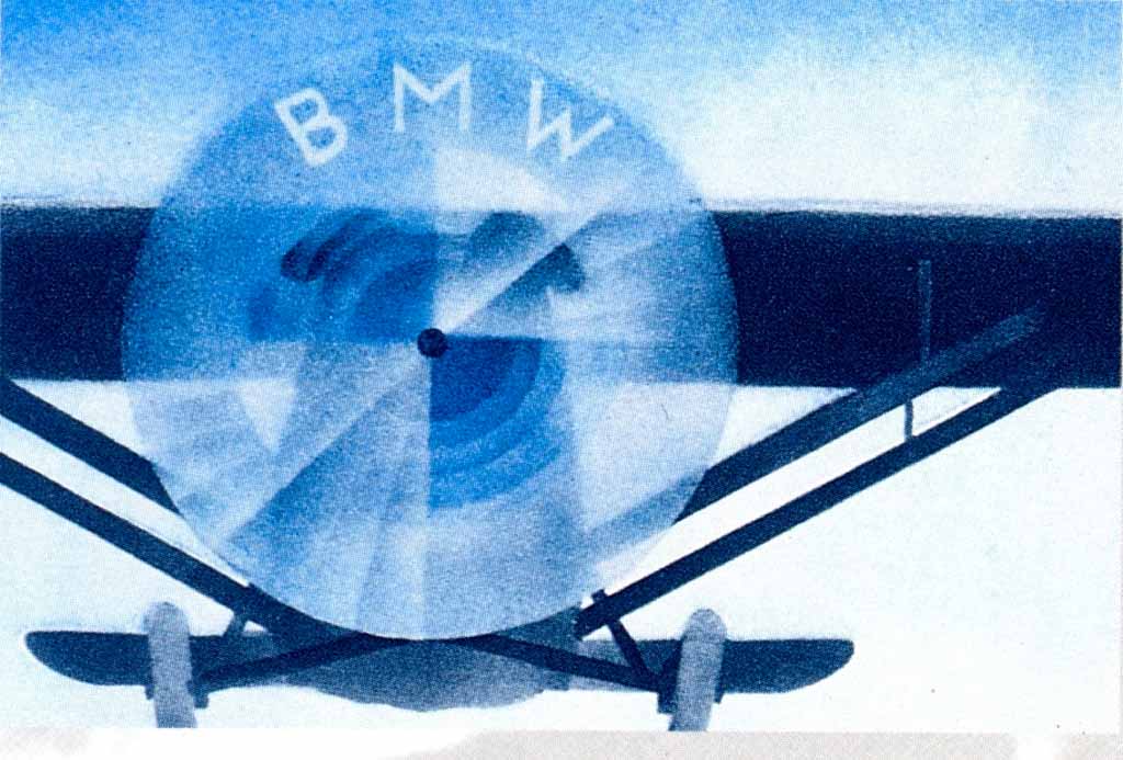
There are many stories about the BMW roundel/emblem that have circulated over the years. I always understood the Roundel was a symbol of an airplane propeller since BMW got its start in the aircraft industry building engines and then branched out to motorcycles. In 1916 the Bavarian Aircraft Works was established (they were building aircraft engines prior to its new, official name) It wasn’t until the 1920s that BMW began building automobiles. The following is an excerpt from motorcarsofgeorgia.com’s website:
The BMW Roundel generally referred to as the BMW emblem is one of the world’s most recognized and lauded symbols. In the early 1900’s Franz Josef Popp registered Bayerische Motoren Werke (Bavarian Motor Works) NOT “British” Motor Works. The Roundel has always featured the circular design with the letters BMW at the top of the outer ring. The inner colors of blue and white are the Bavarian State colors.
The design was not in any way connected with aircraft engines or propellers as is often said within the myths and legends around the brand. The idea that the blue and white had anything to do with spinning propellers comes from a 1929 advertisement that depicted aircraft with the Roundel in the propellers. BMW did enter the aircraft industry when they acquiring the license to manufacture Pratt & Whitney aircraft engines. The basic structure of the Roundel has remained the same over 90 years but there have been subtle changes.
Originally the lettering and outline was in gold, but the emblem has changed slightly. The letters were still in gold but letter became larger and closer together. The cars, motorcycles and advertisements that have come over the years have always featured a similar logo yet there have been many styles of Roundel.
The proportions changed the shade of blue, and the lettering in gold, white or silver with serif or sans-serif fonts in different sizes have varied. In the 50’s BMW made an effort to standardize the Roundel. The use of white lettering became standard and when used on cars and motorcycles it was silver. By the 60’s the font was replaced. In 1997 BMW moved to having the Roundel depicted in 3-D when used in the printed form giving the Roundel a new bolder and dynamic look. The BMW Roundel is now ranked in the top ten of the world’s most recognized commercial logos and is an iconic symbol in its own right. The original design, in its simplicity and symbolism has stood the test of time.
The BMW logo is a registered trademark of the BMW Corporation.

Did You Also Know?
Have you ever wondered why BMW in its infancy, so successful in the aero-engine business, started building something other than aircraft engines? After all, the aero motors built by the company were superb for that day, why not continue moving forward in a fast growing industry?
In war, to the victors go the spoils the saying goes. Well, we all know Germany wasn’t the victor and the Allies weren’t about to allow Germany to rearm themselves which included building war planes that require engines. BMW needed something to do to keep the company going and workers busy in just about any way they could find. BMW Built a small engine for two-wheeled vehicles, but didn’t catch on because it was heavy and slow. The company began building engines for farm equipment and manufactured household goods to maintain a level of relevancy. Over the years engines for stationery purposes such as generators and pumps were produced, and engines for trucks and busses developed. During this period, a 500cc horizontally opposed two-cylinder engine was developed and BMW motorcycles emerged.
